HEX, RGB and HSL Explained: How Color Codes Actually Work
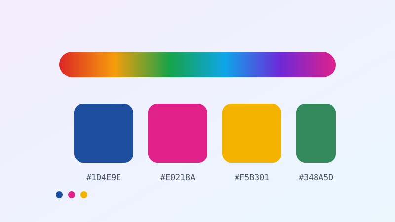
Somewhere in a design file right now, a colour is written as #1D4E9E, and to most people that string may as well be a licence plate. Yet those six characters carry precise instructions to millions of pixels, and once you can read them you can invent, adjust and debug colour without ever opening a colour picker. Better still, you'll be able to answer the question that separates decorative design from professional design: can people actually read this? Because roughly one in twelve men has some form of colour vision deficiency, and a great many beautiful websites are quietly illegible to a meaningful slice of their audience. This is the plain-language guide to HEX, RGB and HSL, how they relate, when each is the right tool, and how to check your colours against real accessibility standards using our free Color Converter and Contrast Checker.
Screens don't mix paint
Everything starts with a fact that contradicts primary school. Mixing paint is subtractive: pigments absorb wavelengths, and piling them together marches you toward mud and eventually black. Screens are additive: each pixel emits red, green and blue light, and piling those together marches you toward white. This is why red and green paint make brown, while red and green light make yellow — a claim that sounds wrong until you've seen it. Every colour on every screen you have ever looked at is produced by three tiny lights at varying brightness, and every colour notation is just a different way of writing down those three brightness levels.
RGB: the honest, literal notation
RGB states the case plainly: how much red, how much green, how much blue, each on a scale from 0 to 255. rgb(0, 0, 0) is all three lights off — black. rgb(255, 255, 255) is all three at maximum — white. rgb(255, 0, 0) is pure red. Equal amounts of all three, at any level, always produce a grey: rgb(128, 128, 128) is a mid grey, which is a genuinely useful thing to know.
Why 255? Because each channel is stored in one byte — eight bits — and eight bits count from 0 to 255. Three channels of 256 possible values gives 256 × 256 × 256 ≈ 16.7 million colours, the famous figure printed on monitor boxes for thirty years. You'll also meet RGBA, which adds an alpha channel for opacity from 0 (invisible) to 1 (solid).
HEX: the same numbers, wearing a disguise
Here's the thing that unlocks HEX codes forever: a HEX code is RGB written in base 16. That's the entire secret. #1D4E9E is three pairs — 1D, 4E, 9E — giving red, green and blue in hexadecimal.
Hexadecimal counts 0–9 then A–F, so a single character covers sixteen values and a pair covers 256 — exactly the range each RGB channel needs, in two tidy characters instead of three. Converting 1D: the first digit is 1 (worth 16 each, so 16) and the second is D (worth 13). 16 + 13 = 29. So #1D4E9E is rgb(29, 78, 158) — a deep, confident blue. You needn't do this arithmetic by hand — that's what the Color Converter is for — but knowing the mechanism means HEX stops being magic.
Two shortcuts pay for themselves. Equal pairs make grey: #333333, #888888, #EEEEEE are all neutral, and any code with three identical pairs is guaranteed to be. Three-digit HEX is shorthand: #F60 expands to #FF6600 — each digit simply doubles. And a quick way to eyeball any code: higher numbers mean more light, so #EAF2FB (all high) is pale, and #12100E (all low) is nearly black.
HSL: the notation designed for humans
RGB and HEX are how machines think. Neither answers the question a designer actually asks, which is "give me that same blue, a bit lighter." In RGB, lightening a colour means adjusting three numbers by different amounts and hoping. HSL — hue, saturation, lightness — was built to fix precisely this.
Hue is an angle from 0 to 360 degrees around a colour wheel: 0 is red, 120 is green, 240 is blue, and back to red at 360. Saturation runs 0% (grey) to 100% (vivid). Lightness runs 0% (black) through 50% (the pure colour) to 100% (white).
Suddenly the operations designers actually perform become trivial. Want a lighter version? Raise the lightness, touch nothing else. Want a muted version? Lower the saturation. Want a colour scheme? Rotate the hue. A complementary pair sits 180° apart. A triadic scheme is three colours 120° apart. Analogous colours — that harmonious, low-drama palette used by roughly every calm website — are simply neighbours 30° apart. This is why our Color Palette Generator works in HSL under the hood: it's the only one of the three notations where "harmonious" has a mathematical definition.
The practical workflow, then: think in HSL, ship in HEX. Design and reason about colour with hue-saturation-lightness, then convert to HEX or RGB for the code.
Contrast: where colour stops being taste
Now the part with real consequences. Whether text is readable against its background is not a matter of opinion — it's a measurable ratio, defined by the Web Content Accessibility Guidelines (WCAG), and in many countries it carries legal weight for public and commercial websites.
The calculation converts each colour to its relative luminance — a weighted measure of perceived brightness. Crucially, the weights aren't equal: green contributes about 72% of perceived brightness, red about 21%, and blue only about 7%, because human eyes are far more sensitive to green light. This is why a saturated blue looks dark and a saturated yellow looks bright even at identical "intensity." The two luminances are then compared, producing a ratio from 1:1 (identical) to 21:1 (pure black on pure white).
The thresholds worth memorizing: 4.5:1 is the minimum for normal body text (WCAG AA). 3:1 suffices for large text — roughly 18pt, or 14pt bold — and for meaningful graphics like icons and form borders. 7:1 is the enhanced standard (AAA) that genuinely helps readers with low vision. That elegant light-grey-on-white body text beloved of minimalist portfolios? It routinely lands near 2.5:1, and it is unreadable for a substantial number of people who will simply leave rather than complain. Paste any two colours into the Contrast Checker and it will tell you the ratio and whether it passes, in about a second.
Designing for colour blindness
Around 8% of men and 0.5% of women have some colour vision deficiency, most commonly difficulty distinguishing red from green. That's a large audience, and the failures are usually invisible to the designer.
The single most important rule is this: never let colour be the only carrier of information. A form field that turns red on error is meaningless to someone who can't perceive the change — add an icon, an outline, and words. A chart whose lines are distinguished only by red and green is unreadable — add markers, labels, or dashed patterns. Red and green also happen to be the most common encoding for pass/fail, up/down and stop/go in interfaces, which makes this the single most consequential accessibility mistake in the field.
Two supporting habits: keep sufficient lightness difference between colours you need people to distinguish, not just hue difference — colours of similar lightness collapse into each other under most deficiencies. And check your interface in greyscale, which is a crude but startlingly effective proxy. If it's illegible without colour, it's illegible for someone.
Beyond sRGB: why your colours look different everywhere
One last honest complication. A HEX code isn't an absolute colour — it's an instruction interpreted within a colour space. The web's default is sRGB, the lowest common denominator, and it's why #E0218A looks broadly the same on most screens. But modern displays increasingly support wider gamuts like Display P3, which can show more saturated colours than sRGB can express. The same code on a wide-gamut phone and an old office monitor will genuinely differ, and no amount of care in your CSS fixes that.
The practical conclusion isn't despair, it's humility: never rely on exact colour fidelity for meaning. Ensure contrast ratios pass with margin, since a colour that scrapes past 4.5:1 on your calibrated laptop may fail on a dimmed phone in sunlight. Test on a cheap screen. The colours you obsess over are approximations everywhere but your own desk.
Building a palette that doesn't fight itself
Most amateur palettes fail for one of two reasons: too many hues, or too few lightness steps. Professional interfaces are typically built from a startlingly small number of hues — often one brand colour, one accent, and a neutral grey — expanded into many tints and shades of each. That expansion is pure HSL arithmetic: hold hue and saturation fixed, and step lightness from about 95% down to about 15%. What emerges is a coherent ladder where every rung obviously belongs to the same family, because mathematically it does.
The neutrals deserve special mention, because grey is where good design quietly happens. A pure grey (saturation 0%) is technically neutral and often looks lifeless beside a saturated brand colour. Nudging saturation to 5–10% and matching the hue to your primary produces a "warm" or "cool" grey that harmonizes rather than clashes — the difference is nearly subliminal and comprehensively separates polished interfaces from student projects. Meanwhile, resist the temptation to give every state its own hue: an interface where success is green, warning is amber, error is red, information is blue, and the brand is purple has five competing signals and no hierarchy.
Finally, decide your palette against your darkest text and lightest background first, since those anchor every contrast decision that follows. Choosing accent colours before you've settled body-text legibility is how teams end up with a beautiful brand blue that fails every accessibility check and cannot be changed because it's on the letterhead.
The colour codes you'll actually meet in the wild
A handful of formats appear constantly, and knowing what each is for prevents a lot of confusion. Named colours — red, tomato, rebeccapurple — are a fixed list of about 140 keywords baked into browsers; convenient for prototypes, too coarse for design systems. rgb() and rgba() give you channel-level control and transparency. hsl() and hsla() give you human control. Eight-digit HEX (#1D4E9EBF) tacks alpha onto the end, which is compact but genuinely hard to read. And in print you will meet CMYK, the subtractive, ink-based system — which is why colours that glow on a screen so often look disappointingly flat on paper. Screens emit light; paper reflects it, and no conversion fully bridges that gap. If a design must live in both worlds, choose the colour in CMYK first and accept the screen version as an approximation, never the reverse.
Quick FAQ
Is HEX better than RGB? They're identical information — HEX is base-16 shorthand. Use HEX for compactness in CSS, RGB when you need to compute with channels, and RGBA when you need transparency.
Why does #FF0000 look less "red" than I expected? Pure channel maximums are the most saturated colour a screen can produce, and they often look harsh or vibrating against white. Professional palettes almost always pull back the saturation and adjust lightness — which is exactly the adjustment HSL makes easy.
What contrast ratio do I actually need? 4.5:1 for body text, 3:1 for large text and meaningful icons, 7:1 if you want to be genuinely inclusive. Check, don't guess.
Are there really 16.7 million colours? In 8-bit sRGB, yes — 256³. Humans distinguish far fewer, and displays with 10-bit channels offer over a billion, mostly benefiting smooth gradients rather than new hues.
How do I build a colour palette from one colour? Fix the hue, vary lightness for a tonal scale, then rotate the hue 180° for a complement or ±30° for analogous harmony. Our Color Palette Generator does this arithmetic for you.
Colour codes look like cryptography and are really just three numbers in a trench coat: how much red, how much green, how much blue. Learn to read them and you gain fluency; learn to think in HSL and you gain control; learn to check contrast and you gain something better than either, which is a design that everyone can actually use. Take a colour you love, run it through the free Color Converter to see it in all three notations, then drop it into the Contrast Checker against your background. If it passes, you've made something beautiful and readable — and only one of those is optional.

Related Articles